Feature

The week in seven charts

Mardi, 05/24/2022

S&P 500 is suffering its 7th consecutive week of losses

S&P 500 slips briefly into a bear market, stocks and bond yields finally diverge, the ECB sets its rate hikes in motion while fears of a Monkeypox outbreak mount. The Syz investment team takes you through the last seven days in seven charts.


Mardi 24/05/2022 - 08:42
Charles-Henry Monchau Chief Investment officer

Chart #1 - S&P 500 slips briefly into a bear market

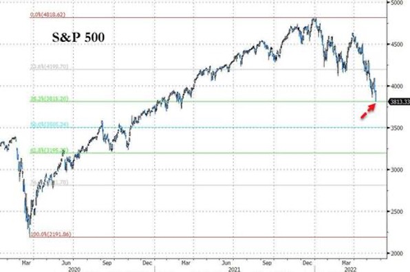
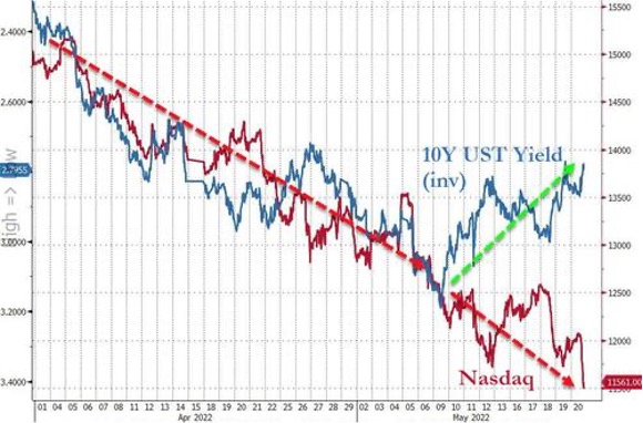
US equities continued their run of negative weekly performance. The S&P 500 index is suffering its 7th consecutive week of losses. Investors fear that rising inflationary pressures may cause consumers to cut back on discretionary spending, effectively increasing the risk of a recession. During Wednesday's market session, US stocks suffered their biggest daily decline since June 2020. Disappointing results from several major US retailers (Target, Walmart, Lowe's and Home Depot) weighed on overall market sentiment. Investors appear to be concerned that the retail giants will be forced to pass on more of their rising costs to customers in the coming months, which could put further pressure on inflation. Comments from several Fed officials during the week did little to calm market fears about the pace of interest rate hikes. US macroeconomic datafell for the fifth week in a row, with the Citigroup Economic Surprise Index slipping back into negative territory and reaching its lowest weekly close since last November.

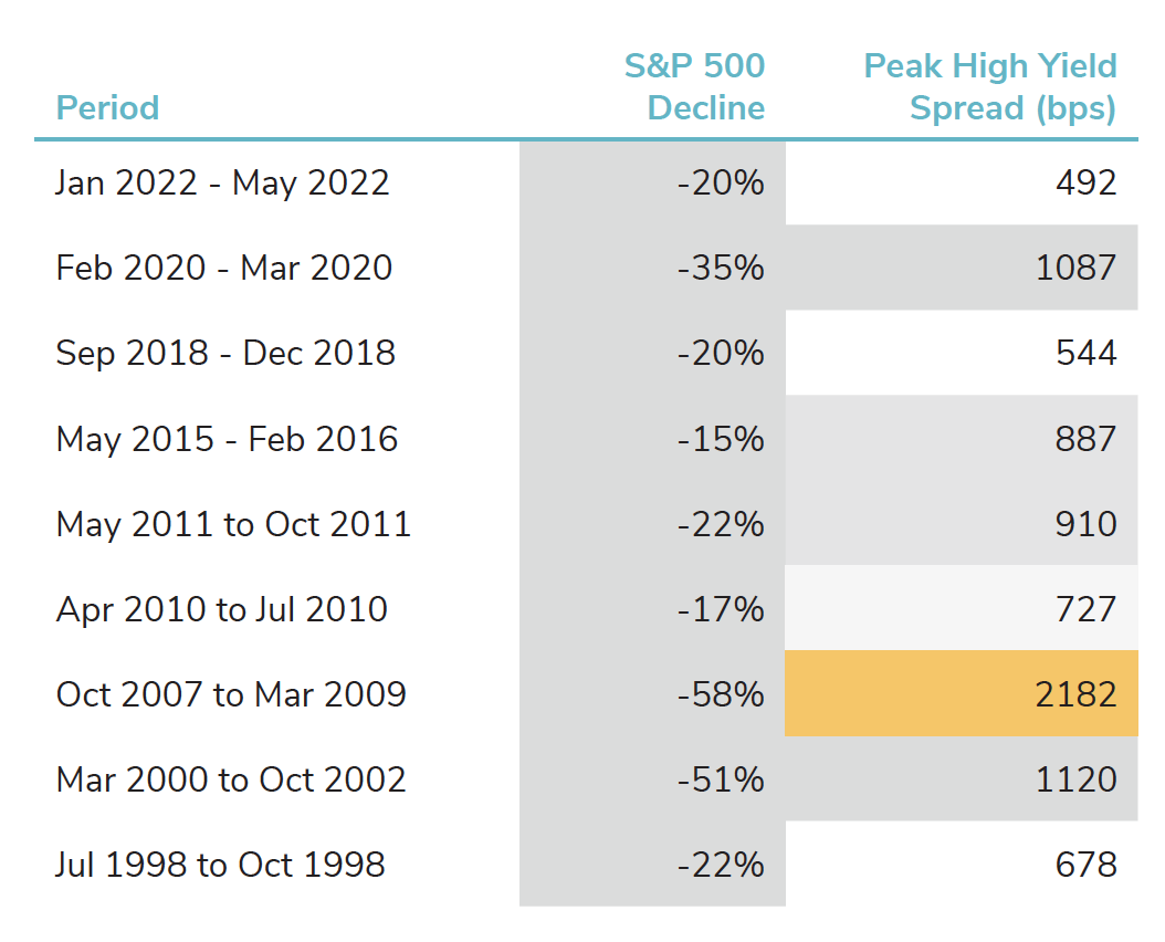
In Friday's session, the S&P 500 briefly entered a bear market, breaking the 20% threshold from its highs. The S&P broke through the 3855-point support, reaching its lowest level since March 2021. But the main US index rebounded at the end of the day to close the session unchanged.

S&P 500 - Briefly entered a bear market
Source
Bloomberg

Chart #2 - Equities and bond yields are finally diverging

The US 10-year bond yield approached 3.00% during the week, before falling back to 2.77%, its lowest level in a month. While bond yields and equity markets have moved in tandem in recent months, last week's dichotomy between bond and equity markets could signal a return to a more normal relationship between stocks and bonds.

Equities and bond yields are finally diverging
Source
bloomberg

Chart #3 - The big rotation

The Nasdaq strongly outperformed other major US equity indices over the past decade, with an annualised return of 18% per year between 2010 and 2019. Over the same period, the energy sector has been one of the worst performers, rising just 3.3% per year between 2010 and 2019, compared to a 13.4% annual return for the S&P 500.

However since the start of 2021, the balance of power has completely shifted. An energy ETF ($XLE) is up 112% versus a -2.6% decline for the QQQ (Nasdaq 100 ETF).

As the chart below shows, the relative over- and under- performance trends are part of long-term trends. For example, technology stocks outperformed energy stocks between 1990 and 2000. Then between 2000 and 2008, it was energy's turn to dominate. The trend changes again between 2008 and 2020 with a strong relative outperformance of technology stocks compared to the energy sector.

Is the outperformance of energy since 2021 part of a long- term trend that could continue into the current decade?

S&P 500 Equal - Weight Energy Divided by S&P 500 Info Tech (Cap-Weighted)

Chart #4 - Monkeypox stocks are surging

Monkeypox cases could accelerate in Europe, a World Health Organisation (WHO) regional official said on Friday, while at least eight European countries have reported cases, including a first declared case in Switzerland and 20 in the UK. The price of GeoVax Labs (GOVX) and Siga Tech (SIGA) micro-caps stocks have almost doubled in a week.

Monkeypox stocks are surging
Source
Crescat Capital, Bloomberg

Chart #5 - US High Yield market more resilient than during previous large S&P 500 declines

Spreads between US high yield and government bonds reached 492 basis points last week, their highest level since November 2020. However, if we compare the level of spreads with other phases of market stress, we can see that previous phases of equity market decline have resulted in higher levels of spreads (543 basis points on average). The current yield spread is the lowest ever observed during such events.


US High Yield Index: Peak Credit Spreads During Large S&P 500 Declines ( 1996-2022)
Source
Charlie Bilello

Chart #6 - Italy BTP spreads over German Bund are widening again

The market seems to have revised upwards its expectations for ECB rate hikes over the past week. The yield curve is now forecasting a 104 basis point rate hike in 2022 for the Eurozone, up from 86 basis points the previous week. It would appear that comments from Mr Knot - a member of the European Central Bank - have had an impact on revising expectations. Mr Knot said that he was in favour of a 25 basis point hike in July, but that a larger hike could be justified.

It is interesting to note that when the market anticipates more monetary tightening from the ECB, peripheral bond issuers are immediately impacted. For example, the risk spread for the 10-year Italian bonds has risen by over 200 basis points recently, pushing 10-year Italian yields above 3%.

Italy 10y Risk Spread over Germany
Source
Bloomberg

Chart #7 - Could the performance of balanced portfolios rebound soon?

Diversified multi-asset portfolios have suffered in terms of performance since the beginning of the year and for an obvious reasons. While bonds and equities tend to be weakly or even negatively correlated, the context has been very different in recent months. Not only are the vast majority of equity markets now down 15-20% since the beginning of the year, but bonds are also posting double digit negative returns in 2022. The result is one of the worst six months on record for balanced equity/bond portfolios.

Good news! Analysis of historical performance shows that periods when balanced portfolios have fallen by more than 5% in one quarter are followed by significant rebounds the next year - about 12% higher on average if you look at historical figures.

Returns Following a -5% Quarter for Balanced Portfolio (%)
Source
Edward Jones