Feature

The week in 7 charts

Montag, 09/19/2022

U.S. inflation surprises to the upside 


The Nasdaq produces worst weekly performance since January, US inflation not cooling as expected, while bonds become increasingly attractive compared to equities.  Each week, the Syz investment team takes you through the last seven days in seven charts. 

Montag 19/09/2022 - 16:29
Charles-Henry Monchau Chief Investment officer

Chart #1 — U.S. inflation surprises to the upside

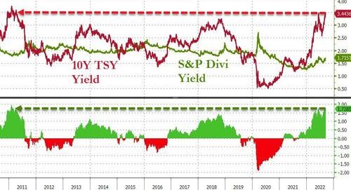
It was the most expected macroeconomic figure of the week: the August US inflation figures. After the pleasant surprise of July's numbers (lower than expected price increases), the market was expecting a confirmation that the US inflation peak is well and truly behind us. Unfortunately, the numbers turned out to be higher than expected. Headline prices rose by 8.3% year-on-year, compared to the expected 8.1%, while core inflation (excluding food and energy) rose by 6.3%, its highest level since March and higher than the 6.1% forecast.


Another reason why investors were disappointed with these figures is that while the contribution of energy declined, services inflation rose sharply. A development that does not please the Federal Reserve. 
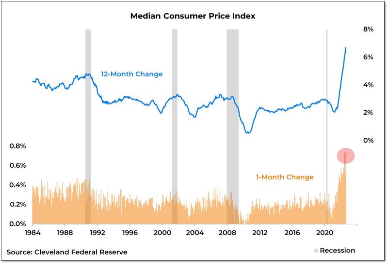
It should also be noted that the median CPI has recorded its two largest monthly increases in history over the last three months. US inflation does not seem to have reached its peak. In fact, it is accelerating and is taking root across the various layers of the economy. The Fed's task is far from over.


As inflation surprises on the upside, signs of a sharp slowdown in economic growth are increasingly apparent. On Friday, transportation giant Fedex lowered its earnings forecast for 2023. Its new CEO told CNBC that he expects a global recession. FedEx stock fell about 21% on Friday, further precipitating the major equity indices lower (see next item).

US Median CPI
US Median CPI
Quelle
Willie Delwiche

Chart #2 — The Nasdaq 100 records its worst week since January

Continued tangible signs of stagflation weighed on risky assets last week. U.S. stocks hit their lowest intraday level since mid-July on Friday. U.S. stocks remain in a bear market as the S&P 500 and Nasdaq recorded their worst week since June. This is the longest period since 2008 that the S&P 500 has remained below its 200-day moving average. 
The large growth stocks were the worst hit last week. The Nasdaq 100 index was down nearly 5.8%, its worst week since January. Leading stocks such as Alphabet and Meta Platforms hit new 52-week lows. 

Weekly variations of the Nasdaq 100 index
Quelle
Bloomberg

Chart #3 — No market capitulation yet

Following the release of US inflation figures on Tuesday, the S&P 500 recorded its worst daily session since June 2020. Yet it still doesn't look like a capitulation as the VIX volatility index (or fear index) did not soar as it did in previous crises (notably at the start of the pandemic). 


On Tuesday, the VIX reached 27, well below the levels that marked the turning points of the market. 

S&P 500 index (in yellow) vs. VIX index (in white)
No market capitulation yet
Quelle
www.zerohedge.com, Bloomberg

Chart #4 — The impressive rise in bond yields

U.S. Treasury yields rose across all maturities this past week. But it was the front end of the curve that rose the most, with two-year yields reaching 3.90% on Friday, the highest level in nearly 15 years. The 2-year to 30-year yield curves continued to invert during the week, reaching their highest level of inversion since September 2000...

The impressive rise in bond yields
Quelle
Charlie Bilello

Chart #5 — Bonds increasingly attractive compared to equities

Following the bond crash, the spread between the US bond yield and the S&P 500 dividend yield is at its highest level since 2011. For asset allocators, this valuation differential is not without consequences and argues more in favor of bonds than stocks. 

U.S. 10-year bond yield (red) vs. S&P 500 dividend yield (green)
Quelle
Bloomberg

Chart #6 — Gold enters a bear market

Despite the inflationary environment in which we have been operating for several quarters, gold is down more than 20% from its highs, a decline that fits the definition of a "bear market. The yellow metal is now trading below $1,700 as ETFs replicating gold's performance continue to record significant redemptions. One of the reasons for gold's decline is the rise in real interest rates (based on expected inflation). 

Gold enters a bear market
Quelle
Bloomberg

Chart #7 — Commodity index at its lowest since February

With the recent decline in the price of crude oil per barrel, but especially industrial metals and agricultural commodities, the S&P GSCI has reached its lowest level since the beginning of the Russian invasion of Ukraine. The index is now down 26% from its peak in March. 

S&P GSCI Commodity index
Quelle
Charlie Bilello, Y Charts